Configure in-app survey and experience widgets using the Moments iQ module for mobile profiles.
The Moments iQ module configures in-app survey and experience widgets for apps built with Tealium Prism. The module is configured in a Tealium iQ mobile profile. Tealium iQ delivers the configuration to the Prism SDK through a hosted settings file or a locally loaded file. You can add multiple Moments iQ modules to a single profile, each configuring a separate experience.
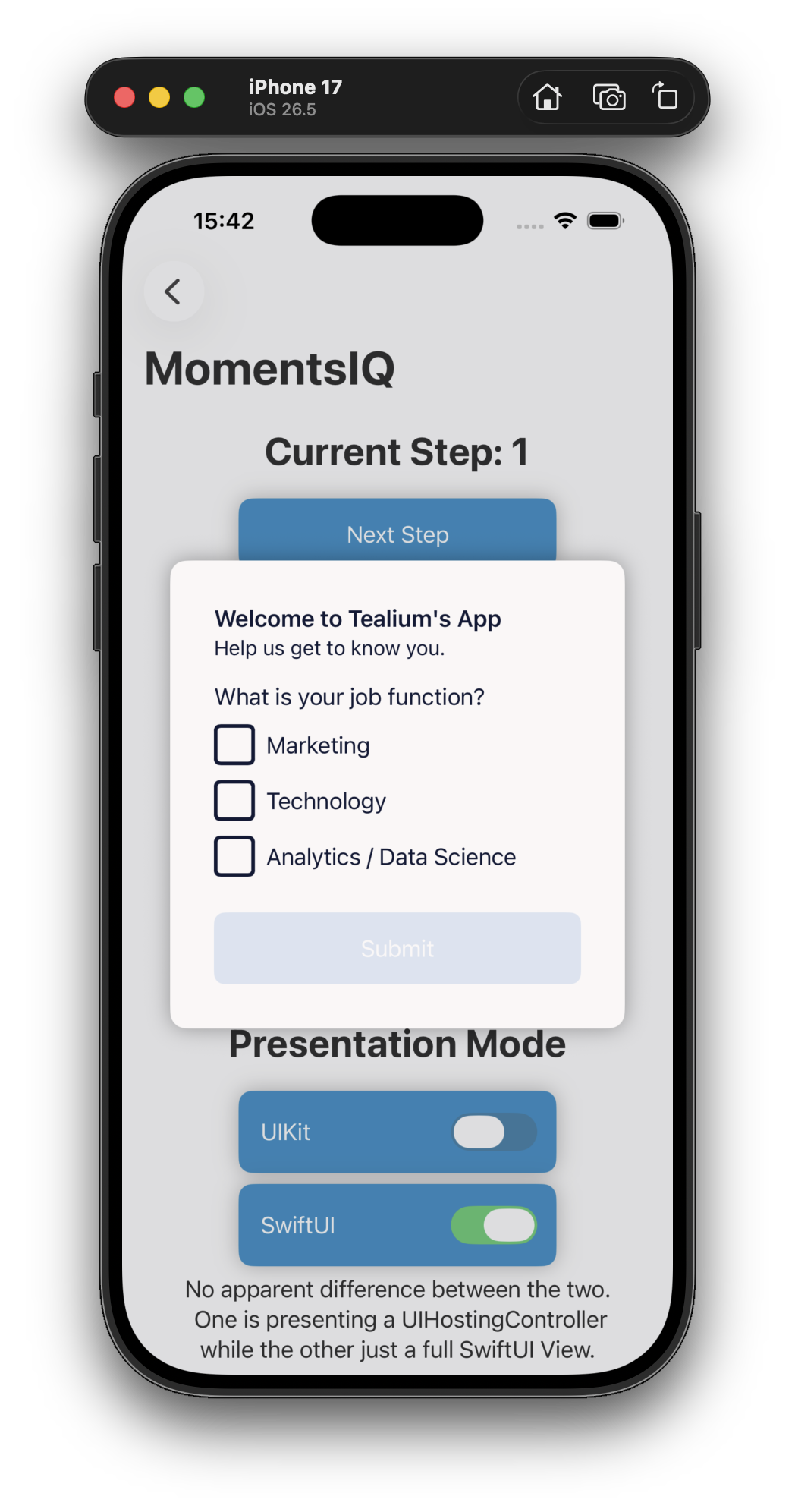
The Moments iQ module is the mobile profile implementation of Moments iQ. For more information, see About Moments iQ.
Requirements
The Moments iQ module requires the following:
- A Tealium Prism mobile profile
Configuration
To create a Moments iQ experience, go to the module marketplace and add the Moments iQ module. For more information, see Modules.
General
| Field | Description |
|---|---|
| Module ID | A unique identifier for this module. Must be unique across all modules in the profile. If only one Moments iQ module is configured, the ID can match the module type. |
| Title | A display name for the experience. |
| Notes | Internal notes. Not visible to users. |
Experience content
The following text fields support dynamic variables.
| Field | Description |
|---|---|
| Header text | The text that appears at the top of the experience. |
| Main text | The text that appears below the header. |
| Question text | The question to ask users. |
| Primary button text | The label for the primary button. The default value is Submit. |
Answer model
| Field | Description |
|---|---|
| Answer type | The input type for the answer: Radio, Text, Checkbox, or Button. |
| Answers | For Radio, Checkbox, and Button types, the answer labels. Supports dynamic variables. |
| Answer required | Set to true to require users to select or enter an answer before submitting. |
| Per-answer redirect URL | An optional redirect URL for each individual answer. If set for any answer, the default redirect URL is ignored. |
| Default redirect URL | The URL to redirect users to after they click the primary button, when no per-answer redirect URL is set. |
Experience behavior
| Field | Description |
|---|---|
| Suppress experience | Prevents the experience from appearing again for returning users. Options: Never (default), After close, After submit, After close or submit. |
| Suppress expiration policy | How long the suppression persists: Forever, Session, Until app restart, or a custom duration in seconds. |
| Track load | Set to true to send a tracking call when the experience loads. Default: false. |
| Track type | The event type used in tealium.track calls for modal close and submit actions: Link (default) or View. |
Image configuration
| Field | Description |
|---|---|
| Image URL | The URL of an externally-hosted image. Must use HTTPS and have a .png or .jpg file extension. |
| Image placement | The placement of the image relative to the experience content: Top (default), Left, or Right. |
Style settings
Style settings use native mobile layout properties rather than CSS. All measurements are in points (iOS) or density-independent pixels (Android). Color values are hex codes (for example, #0A1B36). To include transparency, use the #RRGGBBAA format (for example, #0A1B36AA).
All fields are empty by default. The UI displays default values as captions.
Text
These settings apply globally to all text in the experience.
| Field | Description | Default |
|---|---|---|
| Font family | The font family for all text. | None |
| Font size | The font size. | None |
| Font style | The font style (for example, normal or italic). | None |
| Font weight | The font weight (for example, normal or bold). | None |
| Text color | The text color, as a hex code. | None |
Outer container
| Field | Description | Default |
|---|---|---|
| Background color | The background color of the experience, as a hex code. | #FCFCFC |
| Margin | The margin of the outermost container, as one to four space-separated numbers (for example, 1, 4 6, or 0 1 0 2). | 0 |
| Border radius | The corner radius of the outermost container. | 0 |
| Border color | The border color, as a hex code. A border radius greater than 0 is required for this to appear. | None |
| Width | The width of the outermost container, as a number or auto. | 300 |
| Height | The height of the outermost container, as a number or auto. | auto |
Question container
| Field | Description | Default |
|---|---|---|
| Margin | The margin of the question container, as one to four space-separated numbers. | 0 |
| Text align | The alignment of the question text: start, center, or end. | start |
Answer container
| Field | Description | Default |
|---|---|---|
| Margin | The margin of the answer container, as one to four space-separated numbers. | 0 |
| Text align | The alignment of the answer text: start, center, or end. | start |
| Direction | The layout direction of answers: column (vertical) or row (horizontal). | column |
| Align items | The alignment of answers within the container: start, center, or end. | start |
Button style
| Field | Description | Default |
|---|---|---|
| Primary button background color | The background color of the primary button, as a hex code. | #1B1B1B |
| Secondary button background color | The background color of the secondary button, as a hex code. Only applies when Answer type is set to Button. | #FFFFFF |
Dynamic variables
You can use variables to create dynamic text in the Header text, Main text, Question text, and Answers fields. Enclose the variable name in double curly braces.
For example, if the mobile data layer event contains customer_name, the Prism SDK replaces {{customer_name}} with the value at runtime.
To set a fallback value that appears when no data is available, add a pair of pipe characters followed by the fallback value. For example: {{customer_name || Guest}}.
Tracking data
When a user interacts with a Moments iQ experience, the Prism SDK adds the following variables to the data layer:
| Variable | Description |
|---|---|
tealium_event | The interaction type: momentsiq_submit or momentsiq_close. |
momentsiq_id | The unique ID of this module. |
momentsiq_question1 | The question text, if the user clicked the primary button. |
momentsiq_question1_type | The question type, if the user clicked the primary button. |
momentsiq_answer1 | The selected or entered answer, if the user clicked the primary button. |
momentsiq_questions_answered | The questions answered, if the user did not click the primary button. |
For examples of events, see Moments iQ: Events.
Rules and events
Control when the experience appears using rules and events. To avoid data collisions, configure rules so that only one Moments iQ experience loads at a time.
For more information, see Rules.
Server-side integration
To integrate Moments iQ with server-side activation, collect the data through the Tealium Collect module and link the mobile profile to a server-side profile.
For more information, see Manage Moments iQ: Server-side integration.
Web features not available in mobile profiles
The following Moments iQ features are available for web profiles but not for mobile profiles:
- CSS stylesheet editor
- CSS selector-based placement
- DOM insertion position controls (before, after, begin, end, replace)
- Browser modal placement controls
- Custom script source
- Open redirect in new tab
This page was last updated: October 16, 2026