Manage Moments iQ experiences
This article explains how to manage Moments iQ experiences.
Requirements
- Moments iQ experiences can only be created on Tealium iQ profiles. They cannot be created on profile libraries.
- If you have enabled tag marketplace policy on your account, you also need to add the Moments iQ Experience tag to the Show list, otherwise the tag does not appear in the tag marketplace.
How it works
To create a Moments iQ experience, go to the tag marketplace, click Tealium Moments iQ, and click Continue. For more information, see About tags.
Configuration
Properties
Configure the following settings:
- Enter a Title for the Moments iQ Experience tag. If you have multiple instances of the same tag, use a descriptive title to distinguish it from the other instances.
- Enter any Notes for the tag.
Experience type and placement
Configure the following settings:
- Code Version: Select the version of the Moments iQ experience generation code to use. If you change the code version, you must also update the template.
- 2.0: This version supports all of the features described in this document.
- 1.0: This version does not support the Style Sheet method of configuring the experience style.
- Experience Type: The type of experience to create.
- Modal: The experience will appear as a popup window.
- Embedded: The experience will appear embedded in the page.
- Experience Placement: The location of a modal window. This is only used with the Modal placement option.
- Modal Background Opacity: Select the strength of opacity to apply to the rest of the page. This makes the content stand out more.
- Placement Selector: A CSS selector to identify the page element to place the experience. This is used only with the Embedded placement option. For more information about how to determine an element’s selector, see How to Determine the CSS Selector of an Element.
- Experience Position: The position of the inserted element relative to the element in Placement Selector.
- Before Begin: Before the page element.
- After Begin: Inside the page element, before its first child.
- Before End: Inside the page element, after its last child.
- After End: After the page element.
- Replace: Replace the page element.
- Z-index: This value overrides the z-order positioning of the experience on the page. Higher values stack on top of lower values (for example, “1”, “2”, “-1”, or “auto”).
Experience tracking
Configure the following settings to control how the experience behaves:
-
Suppress Experience: Experiences can be automatically suppressed for returning visitors under the following conditions:
- Never
- After close button selected
- After answer submitted
- After answer submitted or close button selected
The browser stores this information in local storage as themomentsiq_suppresskey.
-
Track Load: Select
Trueto send a tracking call when the experience loads on the page for the first time. -
Tealium Track Type: The type of event used in the
utag.trackcalls that are triggered when tracking modal close and submit actions.- View
- Link
Experience background image
Complete the following steps to add a background image to the experience:
- Under Image Placement, select whether the image background fills the left or right half of the modal.
- Under Image Position, select whether the image aligns with the left or the right of the experience window.
- Under Image URL, enter a link to an https-secured, externally hosted image. Suggested image size: 500px by 400px. The file must have a
.png,.jpg,.gif, or.svgfile extension.
Form
Complete the following steps to configure the text and answers that appear on the experience.
The following text fields support only plain text or any necessary operators for dynamic text. Use the style options to adjust formatting as needed. Do not use line breaks, newlines, tabs, or HTML.
Header
Configure the text that appears on the experience with the following settings:
- Header Text: The text that appears at the top of the experience.
- Main Text: The text that appears under the header text.
- Question Text: The question to ask your visitors.
Answers
Moments iQ provides multiple question formats that allow you to customize the questions that guide the visitor to the right experience on your site.
Configure the question and answers with the following settings:
- Answer Type: The input type for the answer.
- Radio: The visitor can select only a single answer from the displayed list.
- Text: The visitor can enter their answer in a single line field.
- Checkbox: The visitor can select one or more checkboxes with a label.
- Button: The visitor can select one of two answers displayed as buttons.
- Answer Required: Select
Trueto require the visitor to enter or select an answer before submitting the experience. - Redirect Opens Tab: Select
Trueto open a new tab when the visitor clicks an answer or experience with a Redirect URL set. - Answers: For Radio, Checkbox, and Button types, specify labels and optional Redirect URLs for each answer.
- Leave the Redirect URL empty if no redirection is needed for that answer. If you enter a Redirect URL for any answer, the general Redirect URL setting is disabled.
- The Text type ignores the Answer field, and Button type uses only the first two answers and their Redirect URLs.
- Click + Add to include more answers.
- Redirect URL: The URL to redirect the visitor to when no Redirect URLs are set for individual answers and the primary button is clicked.
- Primary Button Text: The text label for the primary button. The default value is
Submit.
Dynamic text
You can use variables to create dynamic text for Header Text, Main Text, Question Text, and Answers parameters. Variables appear between two sets of curly braces. For example, {{VARIABLENAME}}.
The variables can use the following data:
utag.data(for example,{{utag.data.customer_name}})- B object (for example,
{{b.customer_alias}}) - AudienceStream attributes, through the B object (for example,
{{b.variable_name}})
You can set a fallback value that appears when no data is available to insert. Fallback values appear after a pair of pipe characters (for example, {{VARIABLENAME || FALLBACK}}).
Style
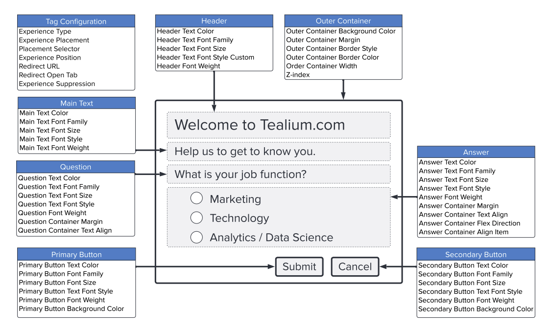
Moments iQ experiences have multiple customizable areas, each of which supports a specific set of style properties. The following image provides a visual reference for the configurable components and the associated CSS-style properties that can be applied to each one. Use this guide to understand which configuration fields control the appearance of text, buttons, layout, and container styling.

Configure this experience to match the appearance of your site. Select one of the following methods to configure the style of your experience:
- Config Field: Enter style settings in a form for each element in the experience.
- Style Sheet: Use a cascading style sheet (CSS) to apply styles to the experience.
Changes made using the Config Fields method do not impact the Style Sheet method, and changes made using the Style Sheet method do not impact the Config Fields method.
If you have more than one Moments iQ experience tag, you must configure the style settings for each experience tag separately.
Manually enter settings
Click Config Fields to enter style settings in a form:
| Parameter | Description | Example |
|---|---|---|
| Font Family | The font family of the text. | Arial |
| Font Size | The font size of the text, as a px or em measurement. |
14px |
| Font Style | The font style of the text. | normal |
| Font Weight | The font weight of the text. | normal |
| Text Color | The color of the text, as a hex code or standard color name. | #1B1B1B |
Outer container
Configure the following settings for the outer container of the experience:
| Parameter | Description | Example |
|---|---|---|
| Outer Container Background Color | The background color of the experience, as a hex code or standard color name. The default value is #FCFCFC. |
#1B1B1B |
| Outer Container Margin | The margin size of the outermost container. The default value is 0. For more information about margin settings, see MDN Web Docs: margin. |
1px |
| Outer Container Border Style | The border style of the outermost container of the experience. The default value is none. |
none |
| Outer Container Border Color | The color of the border around the outermost container of the experience, as a hex code or standard color name. You must set a border style to a value other than none for the border color to appear. |
Black |
| Outer Container Border Radius | The radius of the border around the outermost container of the experience. The default value is 8px. |
8px |
| Outer Container Width | The width of the outermost container. The default value is 500px. |
500px |
Question container
Configure the following settings for the question container of the experience:
| Parameter | Description | Example |
|---|---|---|
| Question Container Margin | The margin size of the question container. The default value is 0. |
0 |
| Question Container Text Align | The alignment direction of the question text in its container. The default value is start. |
start |
Answer container
Configure the following settings for the answer container of the experience:
| Parameter | Description | Example |
|---|---|---|
| Answer Container Margin | The margin size of the answer container. The default value is 0. |
0 |
| Answer Container Text Align | The alignment direction of the answer text in its container. The default value is start. |
start |
| Answer Container Flex Direction | The alignment direction of the answers, either vertically as a column or horizontally as a row. The default value is column. |
column |
| Answer Container Align Items | The alignment direction of the answers within the container (for example: start, flex-start, or self-start). The default value is flex-start. |
flex-start |
Button style
Configure the following settings for the primary and secondary buttons:
| Parameter | Description | Example |
|---|---|---|
| Primary Button Background Color | The background color of the primary button. The default value is #1B1B1B. |
#1B1B1B |
| Secondary Button Background Color | The background color of the secondary button, as a hex code or standard color name. The default value is #1B1B1B. The secondary button settings are used only when Answer Type is set to Button. |
#1B1B1B |
CSS
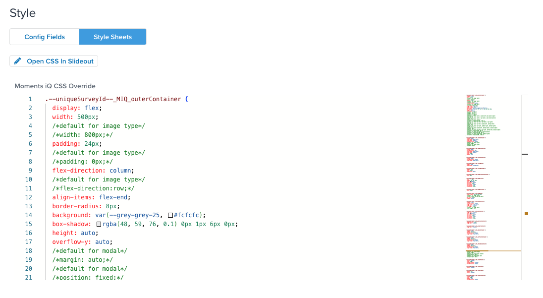
Click Style Sheet to enter style settings in CSS format. A sample CSS file that contains all the available parameters and their default values is provided.

Guidelines for editing the CSS:
- The
--uniqueSurveyId--variable is replaced automatically with the experience ID when publishing. - If you switch from the Style Sheets method to the Config Fields method without saving the tag, your Style Sheet changes will be discarded.
- Do not change any of the class names in the CSS file.
Experience settings with CSS dependencies
CSS properties that appear between slashes and asterisks (for example, /*width:800px;*/) are commented out. They represent alternate values for those properties when you set a use particular Experience Type, Experience Background Image, or Answer Type settings.
Background image CSS settings
CSS properties preceded by a comment that begins with /*default for image represent values that we recommend for tags that use a background image.
For example, the default value for the outer container width is 500 pixels:
.--uniqueSurveyId--_MIQ_outerContainer {
  display: flex;
  width: 500px;
  /*default for image type*/
  /*width: 800px;*/
But if you configure the Experience Background Image settings, we recommend changing the width to 800 pixels. Uncomment the line that sets an 800 pixel width and comment out the line with a standard width of 500 pixels:
.--uniqueSurveyId--_MIQ_outerContainer {
  display: flex;
  /*width: 500px;*/
  /*default for image type*/
  width: 800px;
Be sure to make adjustments to the CSS file for all instances of properties preceded by the /*default for image comment.
Also, if you set Image Position to Right, you need to update the border-radius property to use the alternative values as follows:
.--uniqueSurveyId--_MIQ_imageNode {
  /*border-radius: 8px 0px 0px 8px;*/
  /*default for image right*/
  border-radius: 0px 8px 8px 0px;
Experience type settings
CSS properties preceded by comments that begin with /*default for modal*/ represent values that we recommend for tags with an Experience Type of Modal tags and a particular Experience Placement setting.
For example, the default value for the outer container transformation is translate(-50%, -50%);:
  /*default for modal center*/
  transform: translate(-50%, -50%);
However, if you set the Experience Placement to Top-center or Bottom-center, you need to comment out the standard value and uncomment the value recommended for the transform property to handle the new placement correctly:
  /*default for modal center*/
  /*transform: translate(-50%, 0%);*/

  /*default for modal top-center, bottom-center*/
  transform: translate(-50%, 0%);
Comment and uncomment the lines with values for top, left, right, bottom, and transform as needed for the Experience Placement you selected.
Button type CSS settings
When you set an Answer Type of Button for a tag, uncomment the lines with the values for the answerOptionContainer section:
.--uniqueSurveyId--_MIQ_answerOptionContainer {
  /*default for button type*/
  width: 100%;

  /*default for button type column*/
  margin-bottom: 8px;

  /*default for button type row*/
  margin-right: 16px;
}
Rules and events
Load the experience on all pages or set conditions for when your experience appears. For more information about load rules and events, see Load Rules and Events.
To avoid data collisions, only one Moments iQ experience can appear on a page at a time. If you have multiple experiences, configure the load rules to ensure that only one experience loads at any time.
Data mappings
Use the following mappings with extensions to get dynamic values in the configurations or keep styling consistent from experience to experience:
Basic parameters
| Variable | Type | Description |
|---|---|---|
type |
String | Experience type |
placement |
String | Experience placement |
selector |
String | Placement selector |
position |
String | Experience position |
imagePosition |
String | Image position |
imageUrl |
String | Image URL |
altText |
String | Image alt text |
redirect_url |
String | Redirect URL |
redirect_open_tab |
String | Redirect opens tab |
zindex |
String | Z-index |
headerText |
String | Header text |
mainText |
String | Main text |
questionText |
String | Question text |
answerType |
String | Answer type |
answers |
Array | Answers |
primaryText |
String | Primary button text |
trackType |
String | Tealium track type |
trackOnLoad |
String | Track load |
Text formatting parameters
| Variable | Type | Description |
|---|---|---|
headerTitle.color |
String | Header text color |
headerTitle.fontFamily |
String | Header text font family |
headerTitle.fontSize |
String | Header text font size |
headerTitle.fontStyle |
String | Header text font style |
headerTitle.fontWeight |
String | Header font weight |
mainBodyText.color |
String | Main text color |
mainBodyText.fontFamily |
String | Main text font family |
mainBodyText.fontSize |
String | Main text font size |
mainBodyText.fontStyle |
String | Main text font style |
mainBodyText.fontWeight |
String | Main text font weight |
questionContainer.color |
String | Question text color |
questionContainer.fontFamily |
String | Question text font family |
questionContainer.fontSize |
String | Question text font size |
questionContainer.fontStyle |
String | Question text font style |
questionContainer.fontWeight |
String | Question font weight |
answerContainer.color |
String | Answer text color |
answerContainer.fontFamily |
String | Answer text font family |
answerContainer.fontSize |
String | Answer text font size |
answerContainer.fontStyle |
String | Answer text font style |
answerContainer.fontWeight |
String | Answer font weight |
primaryButton.color |
String | Primary button text color |
primaryButton.fontFamily |
String | Primary button font family |
primaryButton.fontSize |
String | Primary button text font size |
primaryButton.fontStyle |
String | Primary button font style |
primaryButton.fontWeight |
String | Primary button font weight |
secondaryButton.color |
String | Secondary button text color |
secondaryButton.fontFamily |
String | Secondary button font family |
secondaryButton.fontSize |
String | Secondary button text font size |
secondaryButton.fontStyle |
String | Secondary button font style |
secondaryButton.fontWeight |
String | Secondary button font weight |
Container formatting parameters
| Variable | Description |
|---|---|
outerContainer.background |
String |
outerContainer.margin |
String |
outerContainer.borderStyle |
String |
outerContainer.borderColor |
String |
outerContainer.borderRadius |
String |
outerContainer.width |
String |
questionContainer.margin |
String |
questionContainer.textAlign |
String |
answerContainer.margin |
String |
answerContainer.textAlign |
String |
primaryButton.background |
String |
primaryButton.borderRadius |
String |
secondaryButton.background |
String |
secondaryButton.borderRadius |
String |
radioContainer.alignItems |
String |
radioContainer.flexDirection |
String |
checkboxContainer.alignItems |
String |
checkboxContainer.flexDirection |
String |
textFieldContainer.alignItems |
String |
Container and text objects
| Variable | Type | Description |
|---|---|---|
headerTitle |
[Object] | Header Text |
mainBodyText |
[Object] | Main Text |
questionContainer |
[Object] | Question |
answerContainer |
[Object] | Answer |
primaryButton |
[Object] | Primary button |
secondaryButton |
[Object] | Secondary button |
outerContainer |
[Object] | Outer container |
radioContainer |
[Object] | Radio answer container |
checkboxContainer |
[Object] | Checkbox answer container |
textFieldContainer |
[Object] | Text field answer container |
footerContainer |
[Object] | Footer container |
imageNode |
[Object] | Image element |
Data layer variables
The experience automatically adds the following variables to the data layer:
momentsiq_id, UDO Variable
momentsiq_question1, UDO Variable
momentsiq_question1_type, UDO Variable
momentsiq_questions_answered, UDO Variable
momentsiq_answer1, UDO Variable
momentsiq_suppress, Local Storage Variable
Client-side data persistence
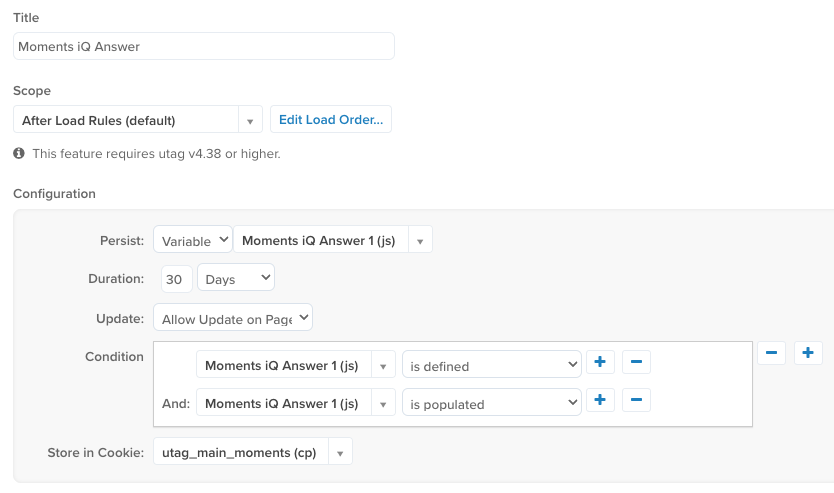
If you want to personalize the visitor experience using the visitor responses to Moments iQ experiences with only client-side tools, you need to store the visitor’s responses with the Persist data values extension cookie.
The following image demonstrates an example of such an extension:

For more information, see Persist data value extension.
Server-side integration
If you plan to integrate Moments iQ with server-side products such as AudienceStream or EventStream, you need to collect the data through the Tealium Collect tag and link Tealium iQ to an AudienceStream profile.
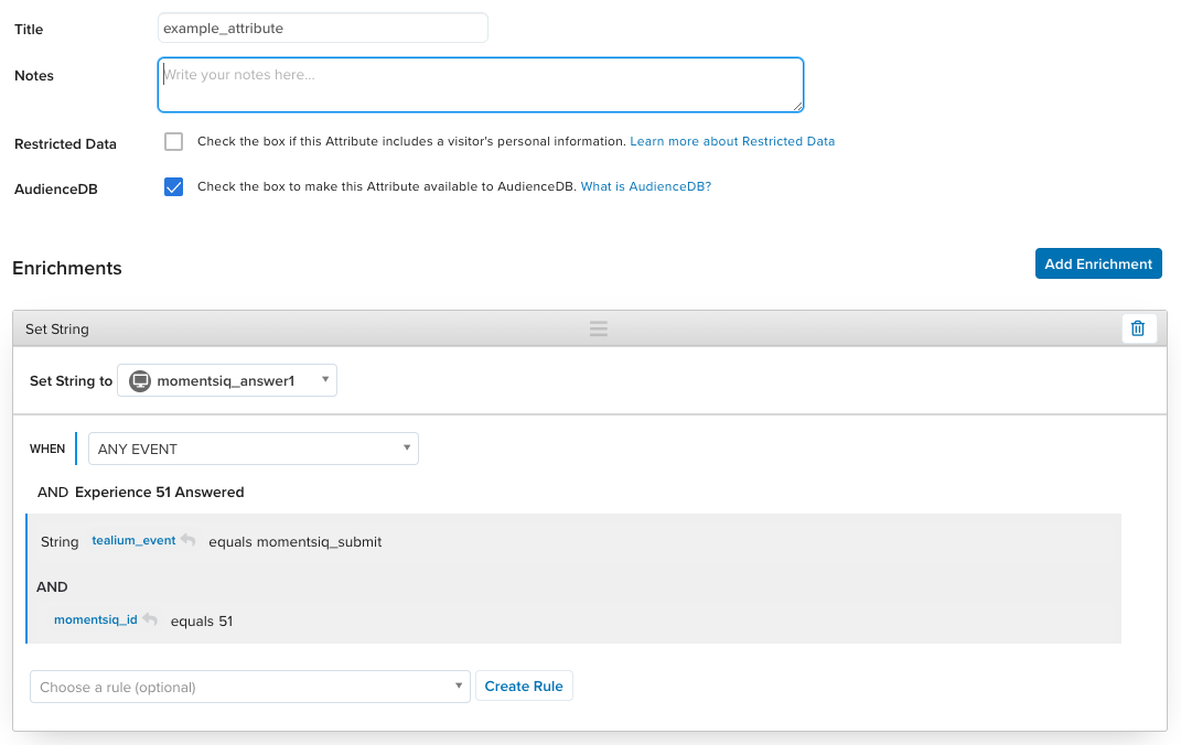
To enrich server-side attributes, create a rule to ensure that momentsiq_answer1 contains an answer and that momentsiq_id matches the UID of the experience you created.
Example:

Also, if you plan to leverage AudienceStream variables in Moments iQ rules, you need to enable data layer enrichment.
For more information, see About data layer enrichment and Tealium Collect tag.
Save and publish
To test and release your experience, follow the same workflow for other tags. For more information, see About tags.
This page was last updated: November 6, 2025